
On Color Psychology: Why Green?
Winter is too grey, and we are all craving green to return here in the Northeast. Everything seems to brighten when that first sprout shoots up through the snow and mud. But why do people feel so much better once spring has sprung? Sure the weather is nice enough, but is there something within us all that is delighted at the sight of fresh greens?
To talk about color, you must first talk about light. Of all the types of electromagnetic wavelength, there is only a small fraction we perceive as visible light.

Some creatures can see infrared rays (some fish and frogs) and others can see ultraviolet light as though it was just another color like bees and birds. What we understand as “color” is entirely based on our physiology, and even among humans ability to perceive colors can vary (consider colorblindness). What scientists do know is that light, natural sunlight, is beneficial for human health. Lack of exposure to natural light, for instance, people who are working desk jobs in offices with limited windows, is linked to higher rates of depression.
Diving into the world of color psychology, there are two key components: a marketing aspect and a scientific aspect that work together to help us understand our collective opinions on colors. Crucially, it is hard to figure out if any two of us will perceive colors in the same way. Linguists have studied the way different cultures use different groupings to discuss color. For instance, if a language only has three color groups, researchers know that those categories tend to be: light, dark, and red. Green and yellow are the next colors to be distinguished separately.

Assuming two people see the same shade of green, based on cultural or personal contexts, they might have different emotional reactions.
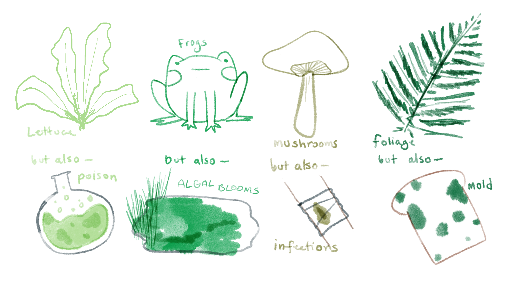
For instance, green might make us think of plants, trees, lush wilderness, and health but it could also conjure images of mold, rot, rust, or poison. Pantone focuses on branding green as natural, luxurious, and refreshing. But what about when Chartreuse (Pantone 584C) is considered sickening or gaudy, or when more neutrals greens are just a little too dull? The words we assign to colors are incredibly arbitrary. They vary between languages, an individual’s ability to perceive colors, or just opinions on where we draw the categories between colors.
Luckily, the natural world works in our favor, and multiple studies in England, Denmark, and Sweden in 2007 and 2008, all concluded that greenspace was good for citizens’ health. One thing European city planners have gotten right is that they know greenspace in their city planning is good for the people. Outside the marketing setting, greenspaces are abundant in the natural world, and a walk through the park is supposed to be idyllic. It’s a community space, an open space, and one where the natural environment itself can improve your quality of life. Many of us perhaps have come to appreciate outdoor space the most when indoor spaces became unsafe and limited in these past few years. Taking a little walk through the park became the highlight of early spring to escape working or school at home. But, according to one study, people who went outside less during the pandemic had higher risks of increased risk of depressive episodes.
So, when spring returns, the science proves you should go outside. It’s good for you.